Percentile Feedback
A percentile feedback graph is a productivity tool for increasing your motivation. It shows you the portion of the day you've worked so far and how that compares to previous days.
"It's 11 AM and you've worked 2.5 hours; that's more than you've worked (as of 11 AM) on 75% of previous days!"
The bottom line is that you get a neat line that goes up when you work, and starts going down when you don't. The nice thing is you can always improve it — even if you've had a rough morning and line is starting low, things are redeemable, just work and it'll go up.
(Note: it's a line because each percentile — 75% — is calculated at some time — 11 AM. When you connect these series of points through the day it shows a line.)
The idea is you have it up so you can see it while you're working. It looks like this:
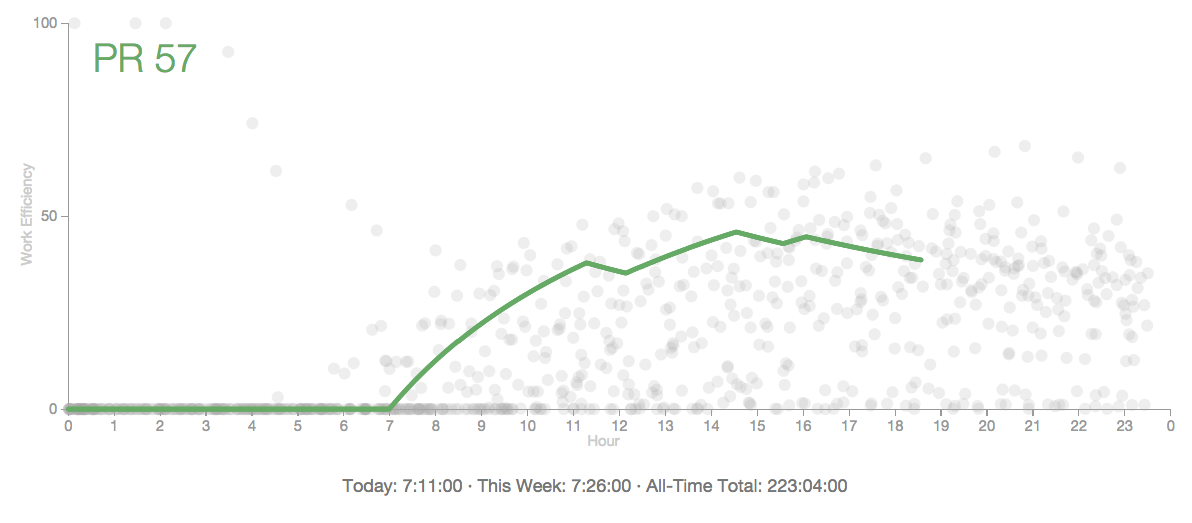
So in this example (which comes from Alex Vermeer), it's almost 7 pm (x axis) and Alex has worked about 40% of the day so far (y axis). Based on logs of previous days and times worked, this is better than 57% of his past days.
The dots are the previous days. If you want, you could plot these as lines too. That's what another implementation by github user matkoniecz does:
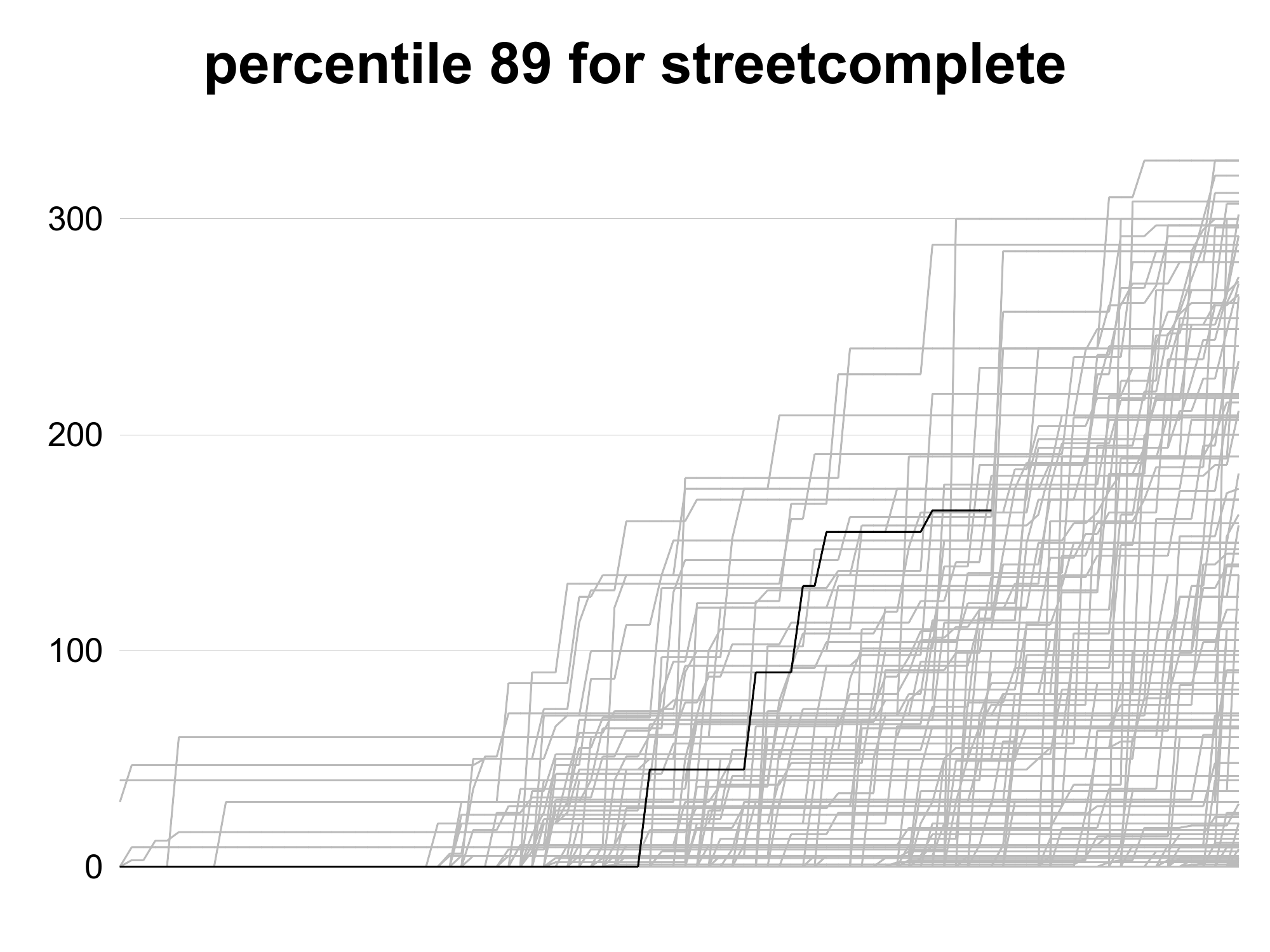
But Vermeer (following Nick Winter) takes a subset of random points from all of the past days lines, which gives a cloud that conveys where you're generally at throughout the day.
Origin
My understanding is the late Seth Roberts came up with the idea and the name, and thought it helped motivate him to work more and better. He even had some stats showing is daily hours worked before and after he started using it, and how the stats were a lot higher afterward.
My Implementation
I liked this idea when I read about it on Vermeer's site and Nick Winter's book and went about making some improvements:
- I hooked mine up to wakatime, to automatically see time spent on various projects.
- I made these projects toggleable (both for what went into the green line as well as the background cloud of points) so I could see time spent on certain projects.
- I made it all a web app in elm (vs the other main alternative at the time, which was a forked script you had to run locally).
- I even registered percentilefeedback.com
I also did a reverse percentile feedback version, for things I didn't want to do (e.g. check twitter or whatsapp). For that I hooked into rescuetime, made things discrete (n of times checked, vs total time), reversed the percentiles (less is better) and made the line red.
Experience
This helped for a bit, and was cool/fine. It was fun to make, and a good opportunity to work on my web app skills.
However, I no longer think things like Percentile Feedback are that effective long term.
Instead, I've come to prefer cultivating habits.
For example, say you have a giant tub of ice cream in your house that you don't want to eat. Having a Percentile Feedback graph is like, "you've only eaten X amount of ice cream today, that's lower than Y% previous days, good job!"
Whereas the habit approach would be to (short term) concentrate and focus your willpower on not eating the ice cream. It's hard at first, but telling yourself you just need to push through it while you're forming the habit helps. After a month (give or take) you'll have the habit, and will be able to abstain with minimal willpower.
The book Superhuman by Habit was influential in my thinking on this, but even before reading it I had stopped checking my charts as often.